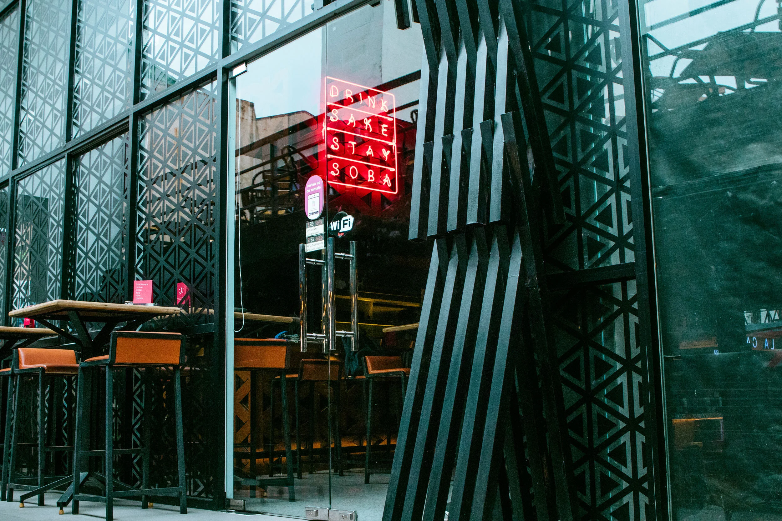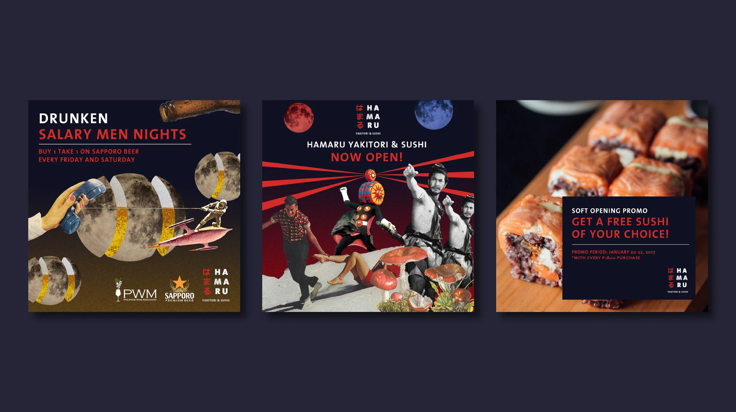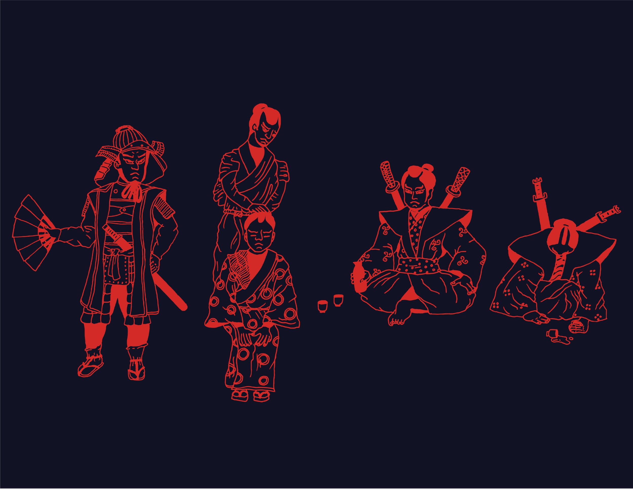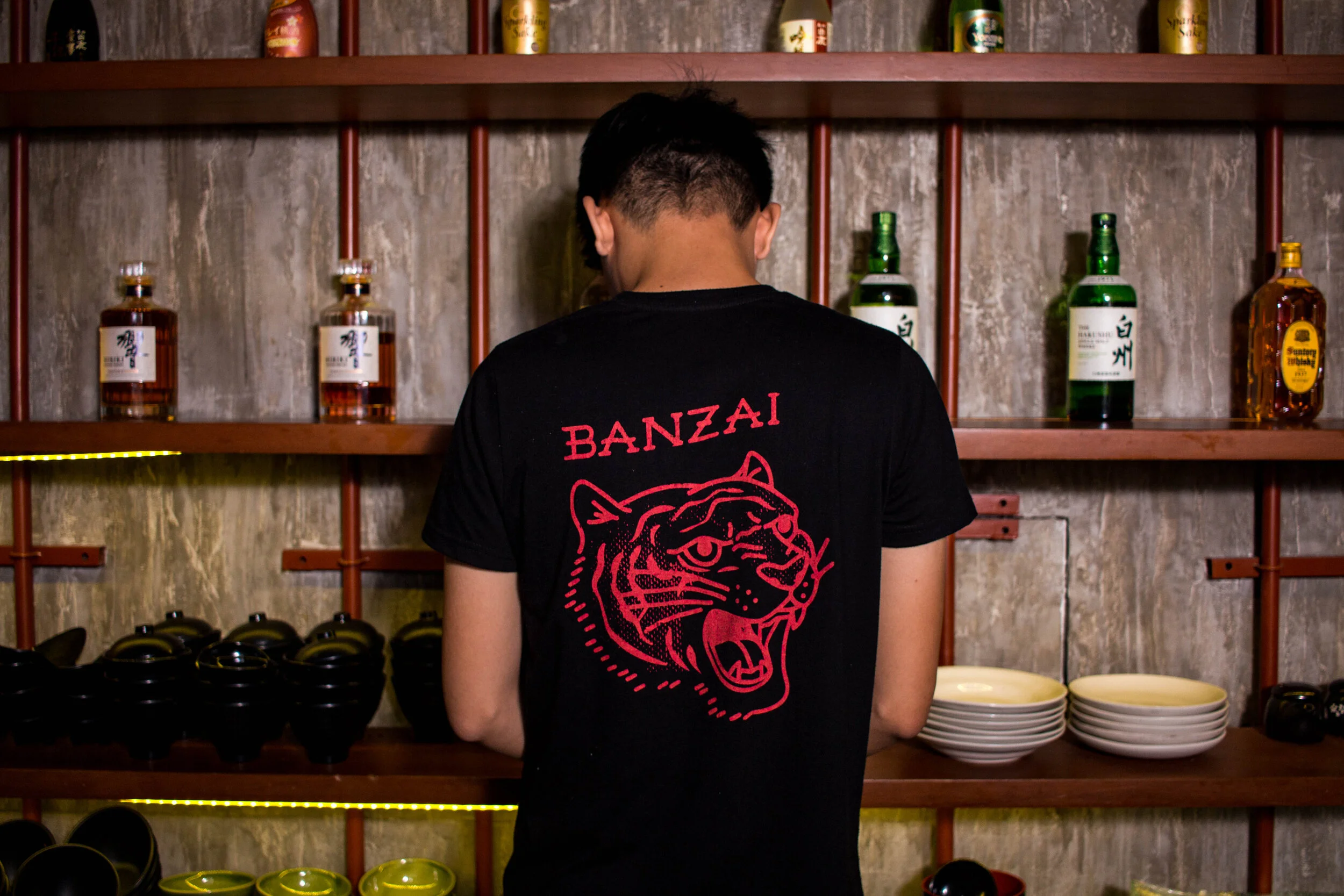
Bringing the restaurant’s vision to life with a modern twist of izakaya culture. View more details on this project at Cocomilk Studio’s website.
Hamaru started tucked inside a food park in Quezon City, and later on became a fixture in the bustling nightlife of the hip neighborhood in Poblacion. The food is a mix of crazy and addicting new flavors—a huge breakaway from typical Japanese fare. Imagine deep fried nori pockets bursting with uni in each bite, tuna‑filled tofu pockets topped with puffed rice, and japanese whisky sours.
BRAND IDENTITY DESIGN, ILLUSTRATION, COLLAGE, MURAL PAINTING, LAYOUT DESIGN
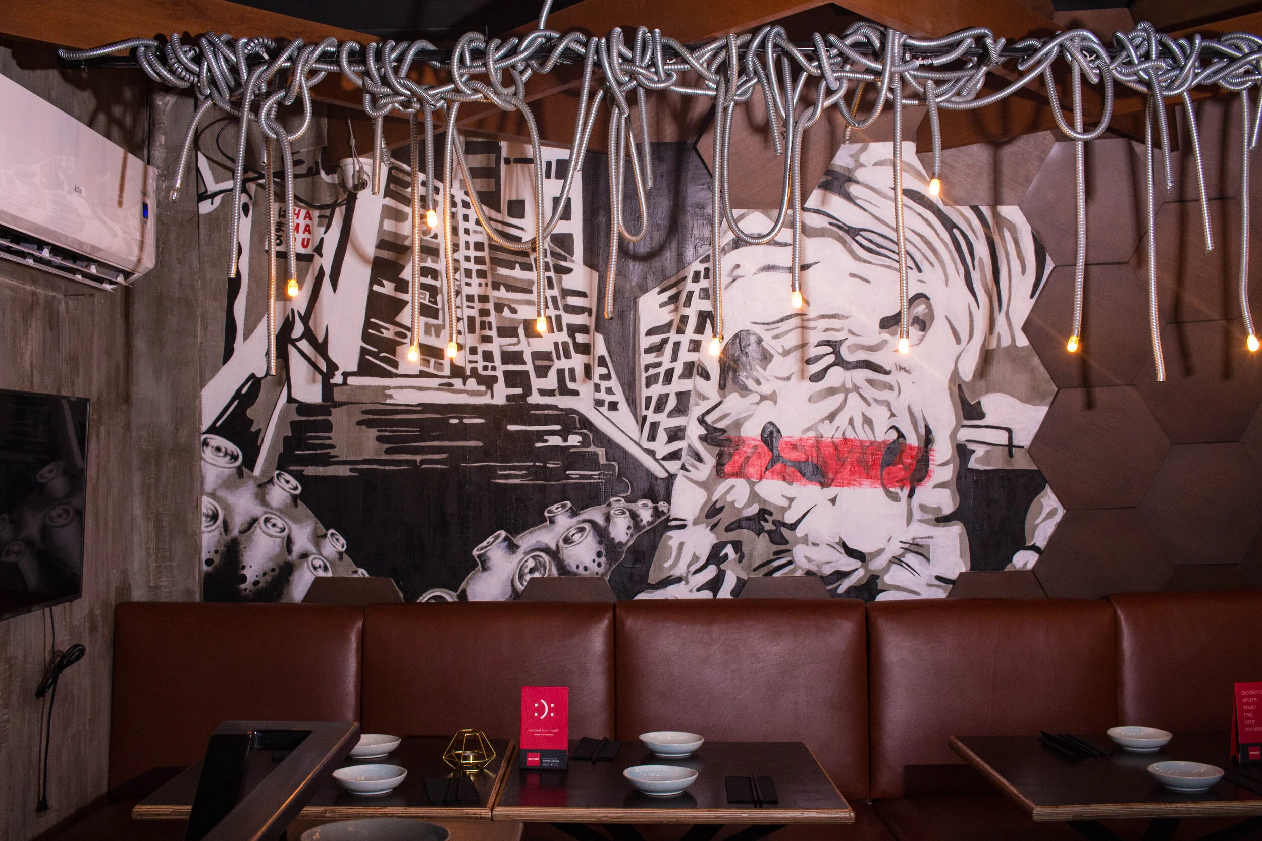
The tiger is a nod to the Japanese embroidered "sukajan" which historically has been both a symbol of a unique cultural exchange and rebellion.
The main brandmark is an embodiment of the modern izakaya—bold, modern but still gritty.
